Why is it important to carefully choose fonts for subtitles?
Fonts have the ability to transmit the emotional tone of the video segment being shown to the audience. Due to that factor and other notable characteristics they play a crucial function in connection with video content. The method of adding subtitles to your visual material has several long-term benefits, but it primarily aims to achieve two key goals:
1. Accessibility
Ensuring that individuals with disabilities have fair access to video and audio data is of utmost importance. This can be achieved by providing closed captioning and subtitle fonts that are specifically designed to cater to their needs.
Closed captions and subtitles play a pivotal role in aiding those with hearing impairments or related issues to comprehend the spoken content in the video that is presented. The inclusion of these features allows individuals who are deaf or have hearing difficulties to engage fully in the audiovisual experience, thanks to accurate transcriptions or translations of the dialogues and discussions.
Moreover, they can track the storyline, grasp crucial information, and wholly enjoy the content, all facilitated by captions and subtitles available in various font sizes and styles.
When it comes to the selection of fonts for captions and subtitles, accessibility guidelines such as the Web Content Accessibility Guidelines (WCAG) provide recommendations to make them more accessible.
Legislation such as the Americans with Disabilities Act (ADA), along with similar regulations from other nations and governments, provide directives for subtitle font size, style, and color contrast to ensure content accessibility for individuals with visual or auditory impairments.
For instance, the subtitle font size should be at least 18 points, and there should be a substantial color contrast between the text and the background. Adherence to these directives will help guarantee that your closed captioning is accessible to all viewers.
Additionally, it is recommended to select fonts that are easy to decipher, exhibit a strong contrast against the background, and allow for text size adjustments, while simultaneously meeting legibility standards. To enhance legibility for those with visual impairments, fonts with clear letterforms and well-designed character spacing are highly beneficial.
Furthermore, it is important to take into consideration the needs of people who experience color blindness. Choosing fonts with high-contrast properties helps for the text displayed together with the video to be clearly distinguishable for people who have color vision issues. For those with low eyesight, fonts that focus on clarity in terms of stroke thickness, drop shadow, and character spacing are especially advantageous.
The timing and synchronization of closed captions and subtitles should also be taken into account by content producers and video editing specialists to further improve the accessibility of the content that is being created.
The display duration of the text on the screen should be sufficient for viewers to read and comprehend it with ease.
When choosing the right font and ensuring optimal placement of subtitles, it is crucial to consider the on-screen visual elements or actions, a harmonious blend of caption text and viewing experience that needs to be achieved.
By prioritizing accessibility in the design of their closed captioning and subtitle systems, content creators and video editors can demonstrate their commitment to inclusivity, thereby making their work accessible to a broader audience.
2. Availability
In our interconnected modern world, content plays a significant role in facilitating global communication. People from different areas of the world produce and consume multimedia content, necessitating its localization in multiple languages.
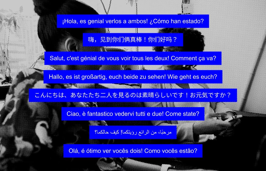
To reach a broader audience and disseminate video content globally, content creators and video editors should consider providing closed captioning and subtitles in various languages, ensuring a smooth and comprehensive process. This allows non-native speakers or those who prefer to communicate in a different language to fully understand and appreciate the content. Subtitles serve to eliminate language barriers, enabling a larger audience to connect with the content through accurate conversation translations.
When selecting fonts for subtitles and closed captioning in different languages, it's important to consider character sets, transcriptions, and other linguistic differences. For example, certain characters or diacritical marks used in some languages may not be supported by specific fonts, potentially leading to rendering errors or unreadable text.
To ensure that closed captioning and subtitles are displayed correctly and maintain readability across multiple languages, it is advised to use internationally recognized, language-friendly fonts that support a wide range of characters.
Additionally, the visual identity or cultural context of the information can be preserved and communicated further by the use of certain font styles.
The authenticity and relatability of subtitles or closed captioning can be improved by using fonts that align with the aesthetic or typographic norms of the language or depicted in the video.
There are various methods and resources available to meet the demand for subtitles and closed captioning in different languages. Automatic translation tools, language localization platforms, and professional subtitling services can be used to produce multilingual subtitles.
These services ensure that fonts, translations, and timing are suitable for each language, providing a seamless and enjoyable viewing experience for international audiences.
Characteristics of best fonts for subtitles
You may be wondering what are the basic criteria you need to understand before choosing subtitle fonts for your videos. Well, there are several factors you should take into consideration in order to better present your media file to your audience.
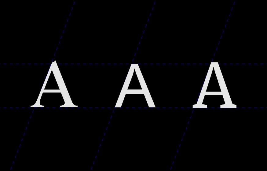
Let's take a look at the following features that make your subtitle fonts clearer than other subtitle font styles:
- Clarity: The clarity of the words in the text is essential for good viewing. It includes spacing between letters, style, etc.
- Compatibility: An important criterion to consider is whether a particular caption font is available to you or supported by a wide range of devices. For example, you might want to watch the movie on your system, player, smartphone or other devices, therefore compatibility becomes important.
- Readability: Text quality needs to support all kinds of lighting and stage effects incorporated during the video playback.
- Color Context: Color contrast is an important factor in determining whether you can read subtitles with different video background effects, directly impacting the perception of the content by the audience.
- Background matching: You need to be mindful of color contrast and possible background matching.
- Positioning: The location and display of the text on the screen is also a crucial factor. This determines whether or not you can easily read the text while viewing it.
- Convenience: The reader should be able to read the text easily and effortlessly, without experiencing any confusion.
Impact of a caption font on the performance of video content
In today's digital era, a vast amount of content is widely available to global audiences. While this abundance of content is great for viewers, it presents a challenge for video creators striving to differentiate themselves and establish a unique style. To make a lasting impression, every aspect of the production process, from filming to editing to presentation, must be faultless – including captioning and closed captioning.

When it comes to choosing a closed caption font, the characteristics are widely similar that of subtitles. Closed captioning is critical to making your video content stand out and appeal to a wider audience.
One of the primary reasons for adding closed captions to videos is to enhance search engine optimization (SEO). Closed captions provide a textual version of the video's audio track, making it easier for search engines to index, understand, and evaluate the content.
Consequently, videos with subtitles or captions are more likely to rank higher in search results, leading to increased visibility and engagement. Stroke and letterboxing are two techniques that can improve the readability of closed captions. While stroke adds a border around the text, helping it stand out from the background, letterboxing creates black bars above and below the text, providing a clear space for the titles to be displayed. These techniques can be particularly useful if your video has a busy or colorful background.
10 best fonts used for subtitles
There are so many free font options that, more often than not, we don't understand what typeface we should choose for your design, presentations, video, or any other type of visual content, including subtitles and captions.
Fonts are an integral part of any blueprint and give the design its own mood and personality. At the end of the day, the best subtitle font for your project is the one that the viewers from your target audience like the best.
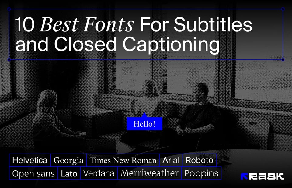
Here is a list of 10 best fonts for subtitles and widely used fonts for captions that are worth taking into consideration:
1. Arial
One of the most often used fonts on our list is Arial, a timeless classic. This modern sans serif font was designed by Robin Nicholas and Patricia Saunders.
As the most popular and standard subtitle font in the video entertainment industry, it has become so widely known that most people are aware of it and can easily identify it regardless of the context. Up until 2007, it was the default typeface in the Windows OS. It is referred to as a typical subtitle typeface and is distinguished by its clarity and readability.
Arial is a classy option for subtitles and has been used for years in academic and professional settings. Its adaptability over a range of displays is expressed by its softer, broader curves and diagonally cut terminal strokes.

2. Helvetica
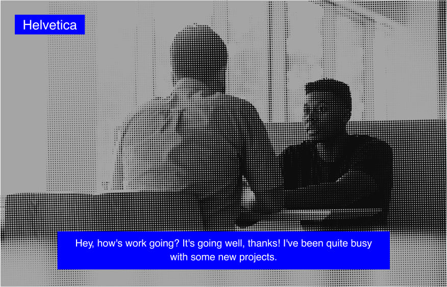
Helvetica is a popular sans serif font that contains Swiss roots, originating from the Latin word “Helvetia”, which stands for Switzerland. The characteristics of Helvetica include its elegance and a certain neutrality, as well as its legibility - even in motion it remains readable and understandable.
Because of its smooth lines and modern look, Helvetica is used in many of the company logos and other visual marketing materials we see around us nowadays. Companies such as Apple, Microsoft, 3M, American Airlines, Jeep, and Verizon, among others, have incorporated Helvetica into their logos. Apple's sympathy for this font is so strong that it was even used across all iPod and iOS platforms.
Graphic designers and videographers frequently opt for this font due to its neutral design, which combines well with a wide range of content types, including video. It effectively communicates the intended information without diverting the audience's attention from the visual elements.
The simplicity and clarity of the Helvetica font make it an excellent choice for informative or educational videos. However, some viewers may perceive it as too generic or overused.
3. Roboto
Roboto is the font that is set as default in the Android ecosystem and most Google products, such as Google Play, Google Maps, YouTube, and others. It was designed by Christian Robertson and is a neo-grotesque sans-serif font with a well-stretched tone.
Featuring geometric yet mechanical shapes, this font is best known for its friendly curves that provide a natural reading flow. Moreover, it can be customized for all types of screens, making it an option that is compatible with a wide range of devices. It's distinctive features make it a good choice for subtitles and captions of different types of video content, such as for movie subtitle font, for example.
It is also a popular choice for videos designed for mobile devices because it can be efficiently optimized for smaller screens.

4. Open Sans
One of the best font types from the Google collection, Open Sans is a humanistic sans serif font designed by Steve Matteson, director of fonts at Ascender Corp. Its open shapes and neutral style make it an easy-to-read typeface that can effectively complement the videotape.
Vertical emphasis combined with sharper contractions gives it a clearer identity. It is also available in a variety of styles and sizes, which increases its versatility, making it a great option to be used as a font for captions, for example.

5. Verdana
One of the widely used subtitle fonts, this sans serif font was designed to improve legibility on the screen. Verdana was designed by renowned type designer Matthew Carter and hand-printed by one of the best lettering specialists, Tom Rickner of Agfa Monotype. Thanks to the talented team behind this font, and the attention to making sure that the reading on the screen is pleasant and clear, it is an effective choice for various types of subtitles, such as movie subtitles.

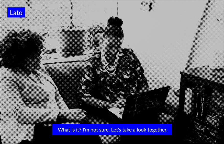
6. Lato
Developed by Lukasz Dziedzic, a Polish graphic designer, Lato is a simple and stunning font from the sans serif font family. Semicircular, sleek, and stylish, this font is easy to read, making it a fantastic option for texts and subtitles in videos.
Regardless of the video niche in which you create content, Lato is a modern alternative to classic font types, enhancing the perception of the material that you share with your audience.
Moreover, its well-defined letterforms, font variations, and multilingual support make it an effective choice not only for video content but also for slides presentations of various types, including Google Slides or Powerpoint.
7. Times New Roman
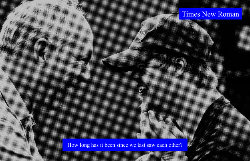
Times New Roman does not need an introduction, but you definitely need to know why it is an outstanding font choice for subtitles. This serif font first appeared in the headlines in 1932, appearing in The Times of London.
The font that was crafted by Stanley Morison and Victor Lardent at The Times, represents a unique, timeless style. Its readability and versatility make it an excellent font for screen captions, capturing the viewer's attention without overwhelming them.
Moreover, the Times New Roman font has earned widespread appreciation as a non-intrusive font that seamlessly blends with the visuals, thereby enhancing the overall aesthetic of the content.
8. Georgia
Georgia is a font that was designed specifically to be used on “screen”, together with video content. It manages to embody infinite beauty and clarity through its simplistic appearance.
This is a classic serif font known for its legible and elegant letterforms. Its well-spaced appearance is great for long sentences. The association with a cheerful look makes it a great choice for subtitles that can accompany lifestyle videos, vlogs, and other lively forms of video content.
Extremely clear in its small size and majestic in its italicized version, Georgia confirms its value despite the abundance of alternatives and reminds us that sometimes, the best tools can be fairly simple. Nonetheless, the Georgia font is able to achieve it’s purpose and effectively convey the intended message in the form of captions and subtitles.

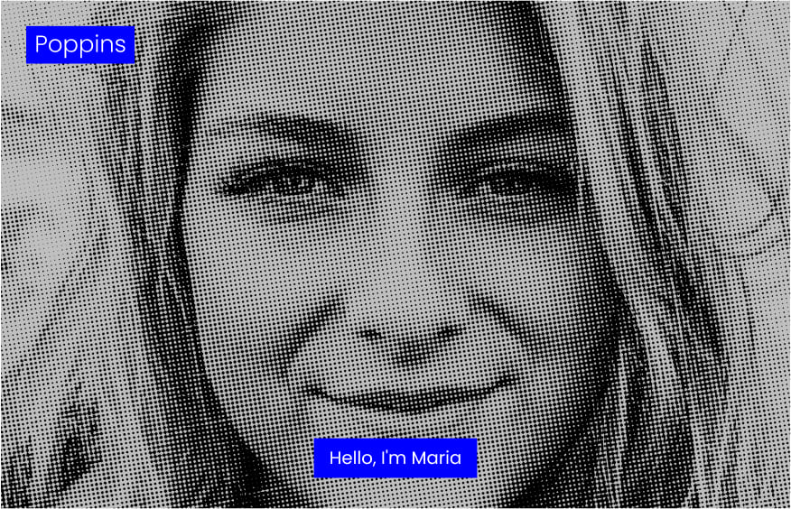
9. Poppins
Designed by Ninad Cale and Johnny Pinhorn, Poppins is a beautiful sans-serif font that can work flawlessly in any video context. It stands out for its stunning circles and geometric shapes.
Practically unilinear, except for some of the optical changes applied to certain spots and ornamentations, this font is a good choice for those who are looking for a minimalist but friendly style to enhance their video content.
10. Merriweather
The Merriweather font, crafted by Sorkin Type, a print shop in Western Massachusetts, USA, is notable for its tall stature and somewhat condensed letterforms with diagonal underlining.
It also highlights open shapes and robust serifs. Due to its artistic design, this font is highly recommended for subtitles intended for large screens. The letterforms themselves are condensed and have a taller X-height, leaving more space between the letters.
If you are looking to incorporate multiple fonts into your project, it works well in combination with Sans Serif and Roboto. However, it is also important to consider the aspect of consistency. If the font changes too often throughout the visual recording, it may cause distraction and inconvenience for the viewer, potentially reducing the impact of the presented content.

Conclusion
When it comes to the selection of a subtitle font or a closed caption font, it is important to clearly identify and outline your purpose as well as the target audience for whom a particular piece of content will be created. Furthermore, your selected font needs to comply with the requirements of the platform on which you are planning to publish your visual content.
Subtitles and captions are considered delicate elements that can significantly impact your video content and the perception that the audience develops about it. Numerous factors contribute to the successful incorporation of these elements. For instance, it's important to consider aspects such as:
- Font size
- Positioning
- Color contrast
- Alignment with the visuals
- Mood and tone of the specific piece of video content
The font and caption style you select should enhance the video, not detract from it. When choosing a font for a video, it's important to consider its tone and style. For instance, a simple, unadorned font may be most suitable for a serious news report, while a more playful font might be a better fit for a fun, light-hearted vlog.
While the video components usually receive most of the attention, some audience members may rely heavily on the textual elements appearing beneath the video. Ensuring the quality of these elements is crucial for creating the right impression of your content.
Remember, fonts hold more power than just their aesthetic appeal. They can transform closed captions and subtitles into a tool that enhances communication and connects viewers from diverse backgrounds to the content they enjoy.


.jpg)
.webp)


![8 Best Video Translator App for Content Creators [of 2024]](https://rask.ai/cdn-cgi/image/width=960,format=auto,fit=scale-down/https://cdn.prod.website-files.com/63d41bc99674c403e4a7cef7/6668a3dcd3175bd1d1c73c81_Best%20video%20translator%20apps%20cover.webp)
![Best AI Dubbing Software for Video Localization [of 2024]](https://rask.ai/cdn-cgi/image/width=960,format=auto,fit=scale-down/https://cdn.prod.website-files.com/63d41bc99674c403e4a7cef7/66685014f68137eb05c89c16_Cover.webp)



.jpg)
